
IN THE FORET;
CAFE IN GREEN,
FOREST AND TREES
2019. 03
Commission, individual
Dongseo university, 166-81, Jurye-ro, Sasang-gu, Busan, Republic of Korea
Cafe IN THE FORET is located in the main campus of Dongseo university, and ‘FORET’ means forest in french.
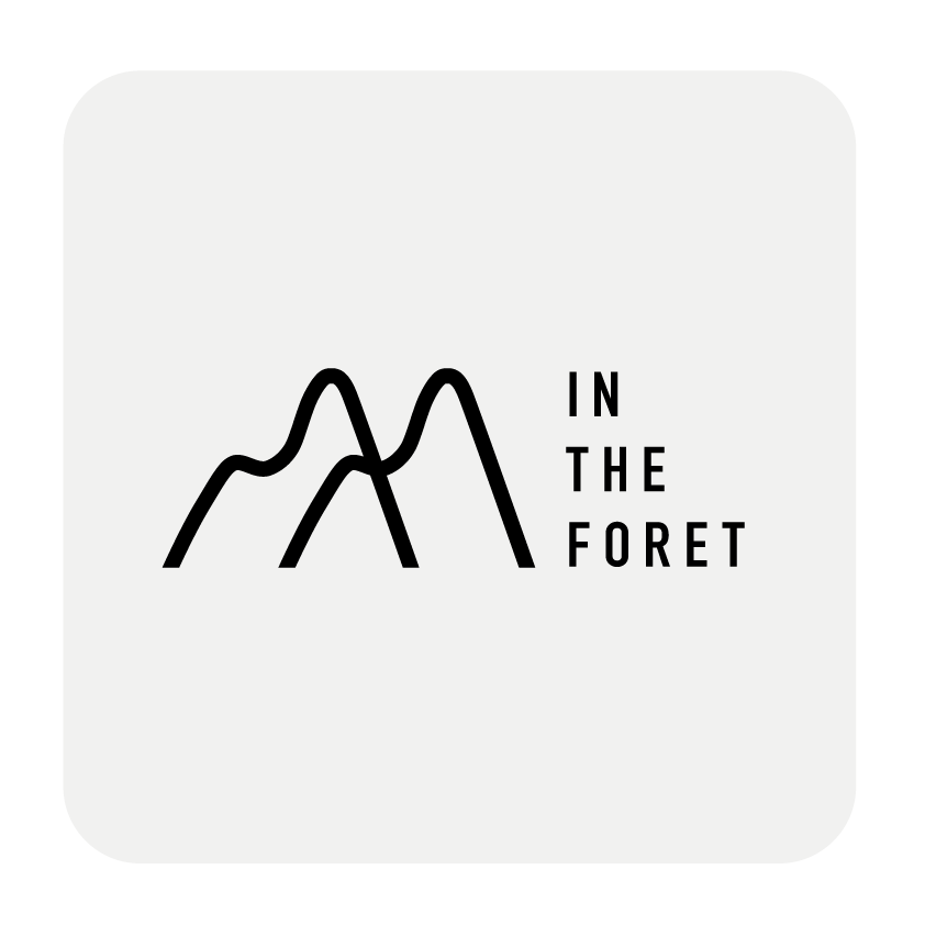

The brand identity of IN THE FORET is rooted in the heart of a mountain.
Dynamic curve lines of mountains and gentle lines of needleleaf trees are translated to the logo of IN THE FORET.
Primary logos _

The design concept is calm forest.
Two rounded rectangles are overlapped, and the brand name ‘IN THE FORET’is arranged between the gap of two scrounds. The smaller scround is made up of three needleleaf trees, sun and the tranquil waters of the lake.
Alternative logos _
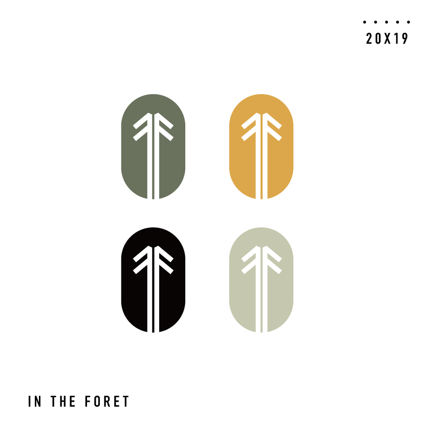


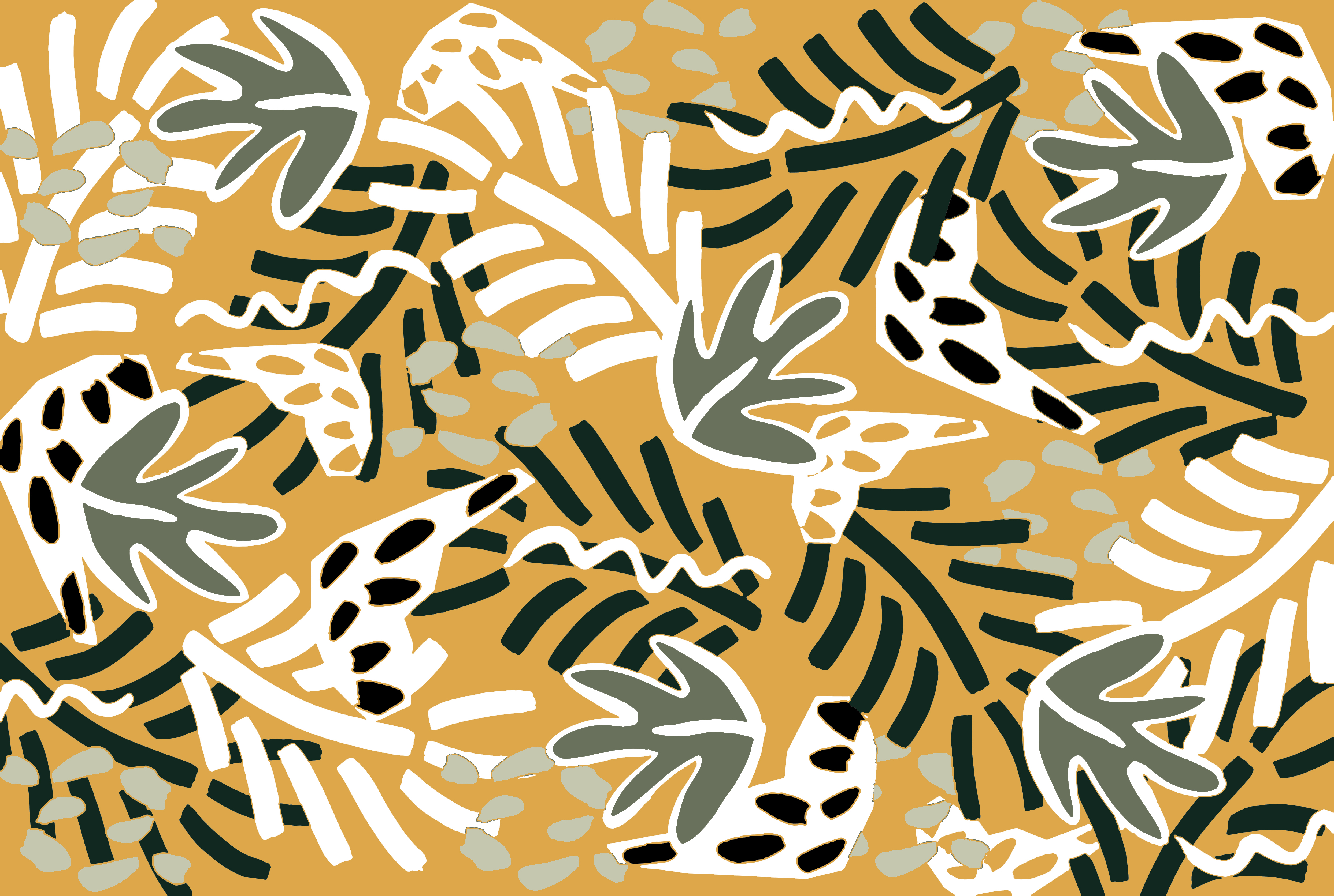
The brand colors are dark olive green, light olive green and mustard.
Color palette _

Dark olive green
CMYK | 62 50 63 2, RGB | 117 121 100
light olive green
CMYK | 27 18 33 0, RGB | 197 199 174
Mustard
CMYK | 15 39 76 0, RGB | 220 167 74
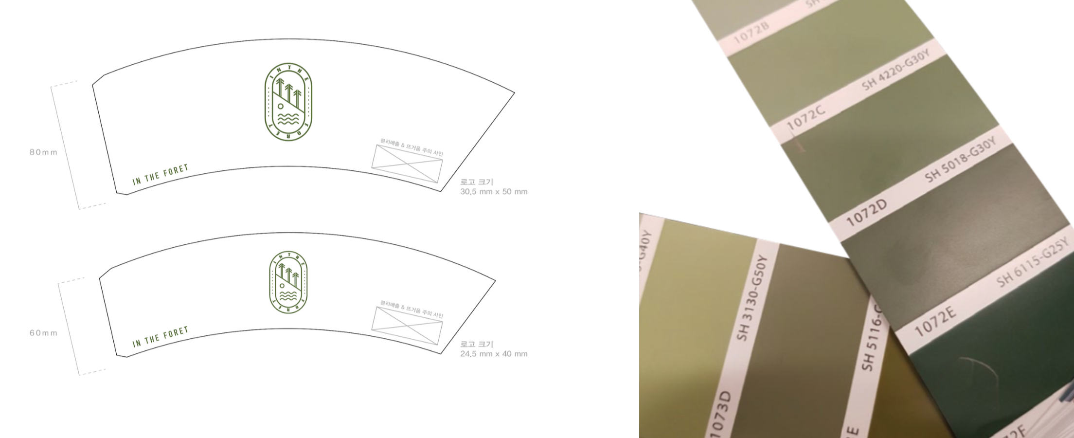
The primary logo is printed on various object, paper cup holder, glass, menu board, sign and packages.
The primary logo is printed on various object, paper cup holder, glass, menu board, sign and packages.


